2025 Rebrand
Unifying two brands into one
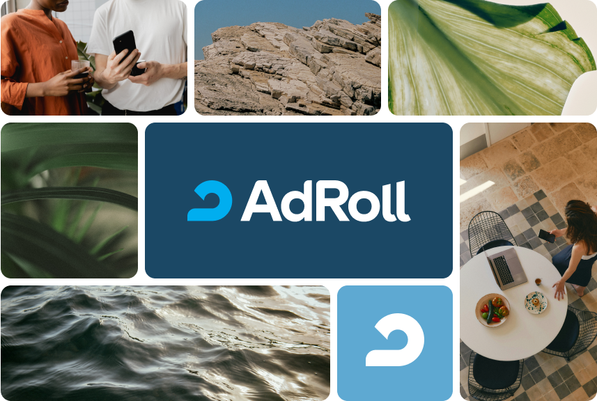
AdRoll (NextRoll) · Creative Director · 2025 · Brand identity / Website / Design system
This was the third company-wide brand transformation I led at AdRoll. The first, in 2018, split the business in two: AdRoll and RollWorks, each with its own identity. I owned the AdRoll side, built directly with executive leadership and a large creative team executing behind it. A 2020 refresh evolved the AdRoll identity into a new brand persona and guideline system. The 2025 consolidation brought both brands back under one roof.
Two brands, one deadline
In 2018 RollWorks took ABM and B2B side, which let AdRoll narrow to SMB and mid-market: the accessible, fun tone behind our #DareToGrow campaign. In 2025 that reversed. The mandate was to fold RollWorks back into AdRoll, one identity and one site, so AdRoll had to carry the ABM and B2B audience again without losing the approachability it had spent years building.
It was a full brand overhaul plus a website migration on a compressed timeline, with inputs shifting late. Marketing had to move in step with product, and even at launch we weren’t sure what the product side would have ready. So beyond the identity itself, I was deciding what shipped at launch and what moved to a phase two.
The system
Where the 2018 and 2020 identities leaned fun and accessible, built for self-serve users and small teams, 2025 had to hold that warmth while reading credible to the ABM and enterprise buyers RollWorks used to own.
The identity started with the audience: established marketing teams that know what they’re doing, stuck on systems that weren’t built for them. From there we rebuilt the brand persona (a trusty, clever mentor) and set four traits to hang every decision on: insightful, assured, down-to-earth, clever. We named the mood Organic Intelligence: warm and human on the surface, sharp underneath. That’s what let one brand speak to a self-starter and a B2B buyer at once.
That persona had to show up in the visual language. I defined and authored it: an earth-toned palette anchored by the heritage AdRoll blue, a serif with quirks over a workhorse sans, hand-drawn icons for moments of charm. All of it landed in an updated brand book and guidelines teams could execute against without guessing. Those guidelines are now the source of truth for brand decisions across the company.
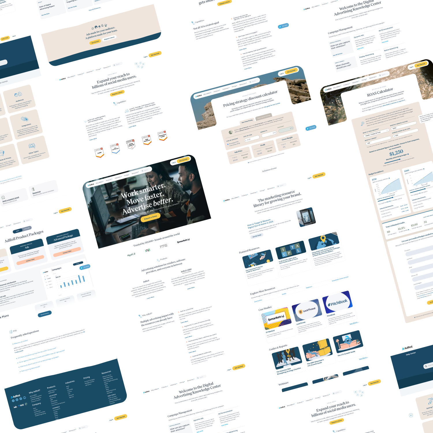
Shipping the site
The redesigned marketing site was the centerpiece. I led creative direction on a clean, sharp design that carried the new identity into a faster, more cohesive experience, and I owned the web side of the migration. A web designer/developer ran the build day to day. When the timeline tightened, I designed screens in Figma and built alongside them. The site stayed stable and performant through the entire transition.
The migration was also a consolidation. I worked with product marketing to give the ABM offering real coverage on adroll.com, from net-new pages to updates on core ones like pricing, then owned a full set of 301 redirects so RollWorks content, blogs, and resources kept their equity instead of 404ing. We kept both properties instrumented, watching traffic and the support queue for confusion, and once everything held, gracefully shut down the RollWorks servers.
Key screens
Sixty days later
Measured against the sixty days prior.